Shopify One-Page Checkout: Why it surpasses & How to active it
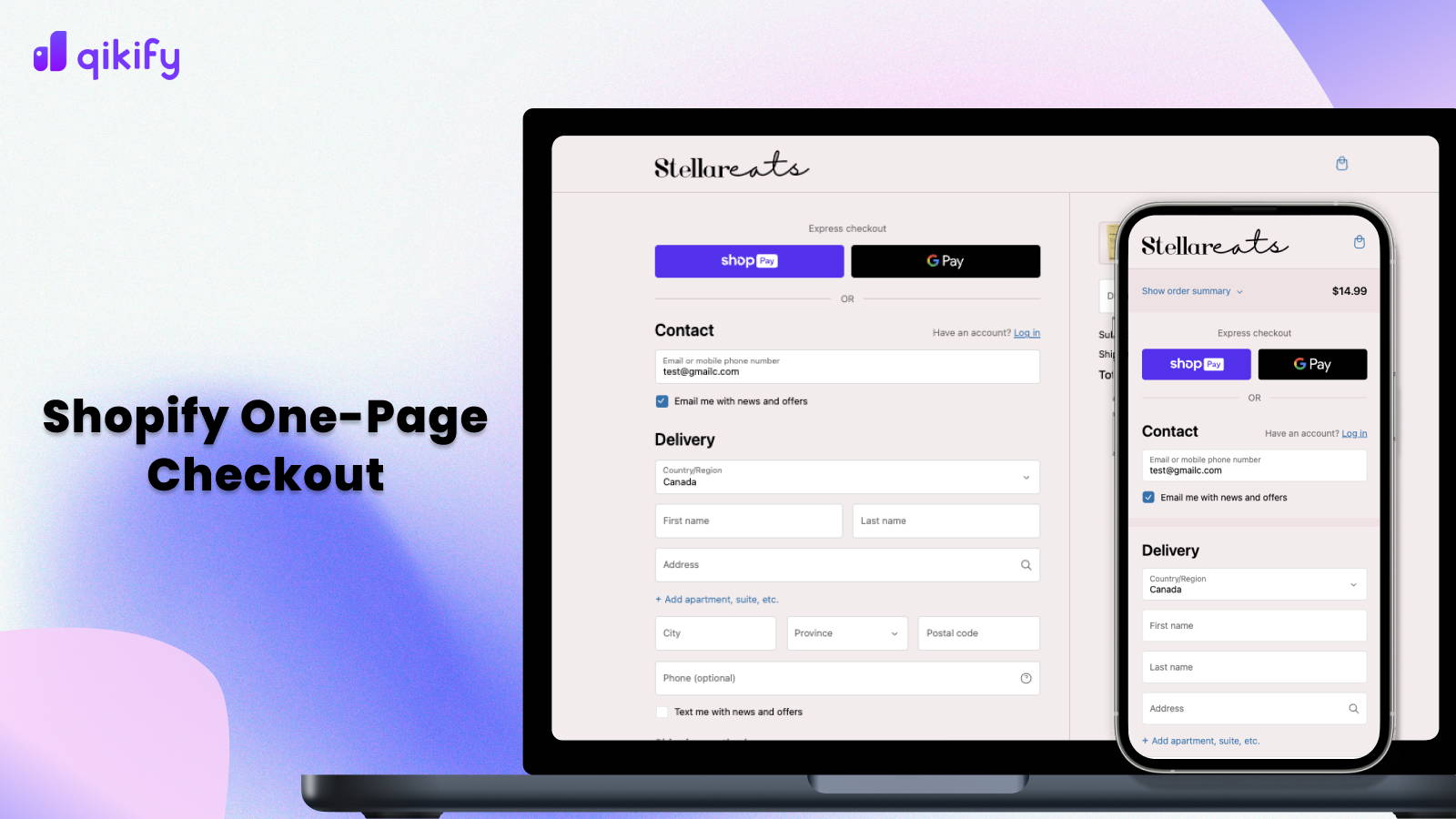
In the dynamic world of online commerce, a seamless checkout process plays a crucial role. It represents the final step for visitors to transition into actual buyers. Born out of a drive for optimization, the Shopify one-page checkout process represents a leap forward from the conventional 3 or 4-page method of getting customer information, processing payments, offering shipping options, and order reviews.
The streamlined one-page approach addresses known issues from previous checkout formats, consolidating these critical steps onto a single, easily accessible page. Shopify one-page checkout is strategically designed to expedite order completion.
What is Shopify one-page checkout?
Shopify's one-page checkout condenses the once-lengthy process into a single, efficient page. This simplifies and speeds up the checkout process, making it faster and more user-friendly. They can input their information, select shipping and delivery options, make payments, and review their order, all in one handy place.
This purpose-built one-page checkout addresses common issues encountered in the three-page checkout.
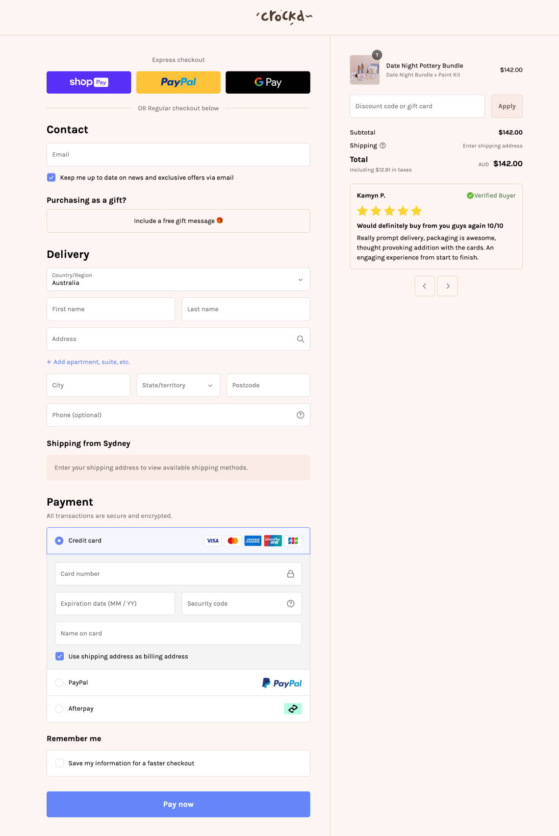
Baymard's 2023 report highlights that 18% of abandonments result from lengthy or complicated processes. With the continued global rise in mobile e-commerce sales, it's imperative to enhance the buying experience for mobile users. The primary objective of the Shopify one-page checkout is to reduce the time required to complete a purchase, ultimately boosting conversion rates and driving sales.
Transcendence of Shopify One-page checkout
1. Shopify One-Page Checkout Is Faster
While some may argue that combining all required sections into a single page could slow down the loading speed, this notion is not entirely accurate. Shopify has meticulously designed and engineered their one-page checkout with the primary goal of expediting the process. They've developed an integrated, advanced checkout platform, optimized for speed. The streamlined system automatically updates saved information and simplifies billing address selection for enhanced convenience.
Consequently, Shopify has recorded an average of 4 seconds faster checkout completion time with the utilization of the Shopify one-page checkout. Additionally, this approach reduces both page loads and shipping rate load times, requiring fewer page loads and clicks. By consolidating all vital steps onto a single page, enabling seamless review without the need for page-switching, it significantly saves time and effort for customers. Looking at examples like Shopify's one-page checkout really highlights the efficiency and user-friendly design principles in action in the world of e-commerce.
2. The feeling of ease during the checkout process
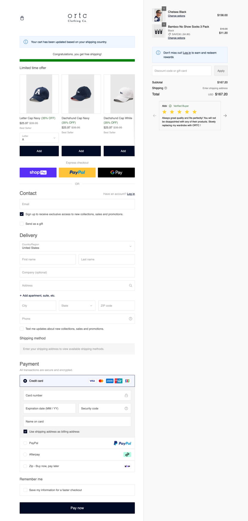
Every information of the order is shown on one place - ortc Clothing
3. Enhance mobile Shopping Experience
As of 2023, Statista reports that mobile e-commerce constitutes a substantial 60% of global e-commerce sales. Nowadays, people heavily rely on their mobile devices for various activities, including entertainment, socializing, work, and, of course, shopping. Prioritizing the shopping experience for mobile users is a logical step. For those making purchases on mobile devices, scrolling is a more familiar action than switching between pages, making the Shopify one-page checkout with scrolling a more user-friendly and convenient option compared to the multi-page checkout.
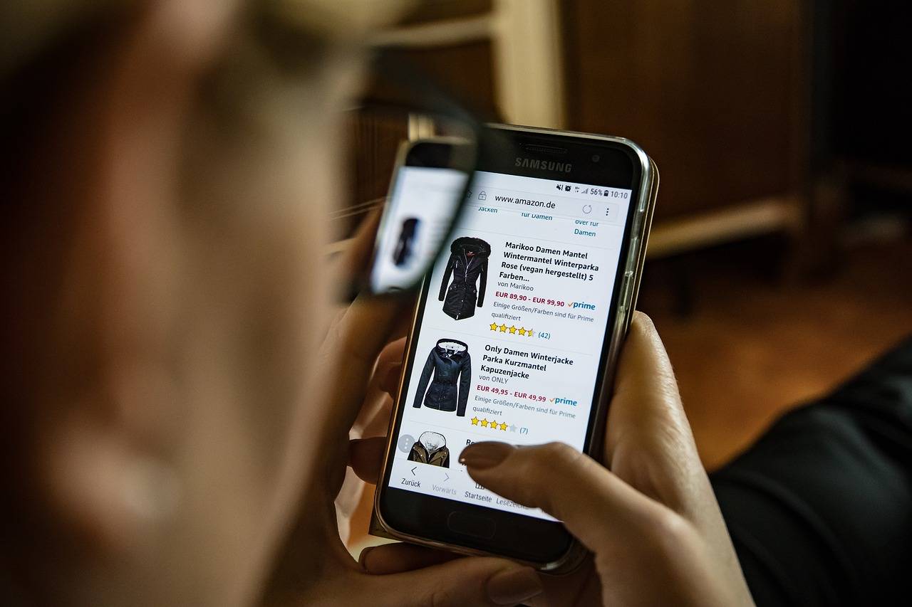
Mobile eCommerce constitutes up to 60% of global eCommerce sales
What to pay attention To
Though there are articles discussing the advantages and disadvantages of Shopify one-page checkout, the reality is that there is no one-size-fits-all set of pros and cons. It all depends on your specific business, your primary customer base, their purchasing habits, and the ultimate objective in optimizing the checkout page. What may be a perfect fit for one store might not be suitable for another.
In the next section, we'll highlight key considerations that can aid store owners in determining the most fitting layout for their needs.
1. Target customers
Target customers exhibit diverse buying behaviors, influenced by factors like gender, age, and the average selling price. For instance, men tend to be more inclined to take risks related to fraud, potentially requiring less emphasis on trust-building during checkout.
Customers buying high-ticket items, like ground pools over $1,500, may seek reassurance through testimonials and trust badges. This need is higher than less expensive items like casual clothes or food. Integrating supplementary elements, such as testimonials and trust badges, into a three-page checkout is generally less overwhelming for customers than a one-page checkout.
Add trust badges, and testimonials to your checkout page easily with no coding skills with qikify Checkout Customizer: app store link.
Add trust badges, and testimonials to your checkout page easily with qikify Checkout Customizer!
2. Customize checkout page to maximize conversions

Notice on the deprecation of Checkout.liquid by Shopify
How to activate Shopify one-page checkout
Actually, all non-Plus merchants were automatically migrated on 2nd October 2023, to one-page checkout without the option of going back. Only Shopify Plus merchants can choose to switch between these two checkout page layouts.
For Shopify Plus merchants, you can easily choose your desired checkout layout at the Settings of Checkout Custom Editor by following these steps:
Go to your Shopify Admin > Settings > Checkout > Customize
On the Editor, click the Settings button and scroll down to the Checkout layout section.
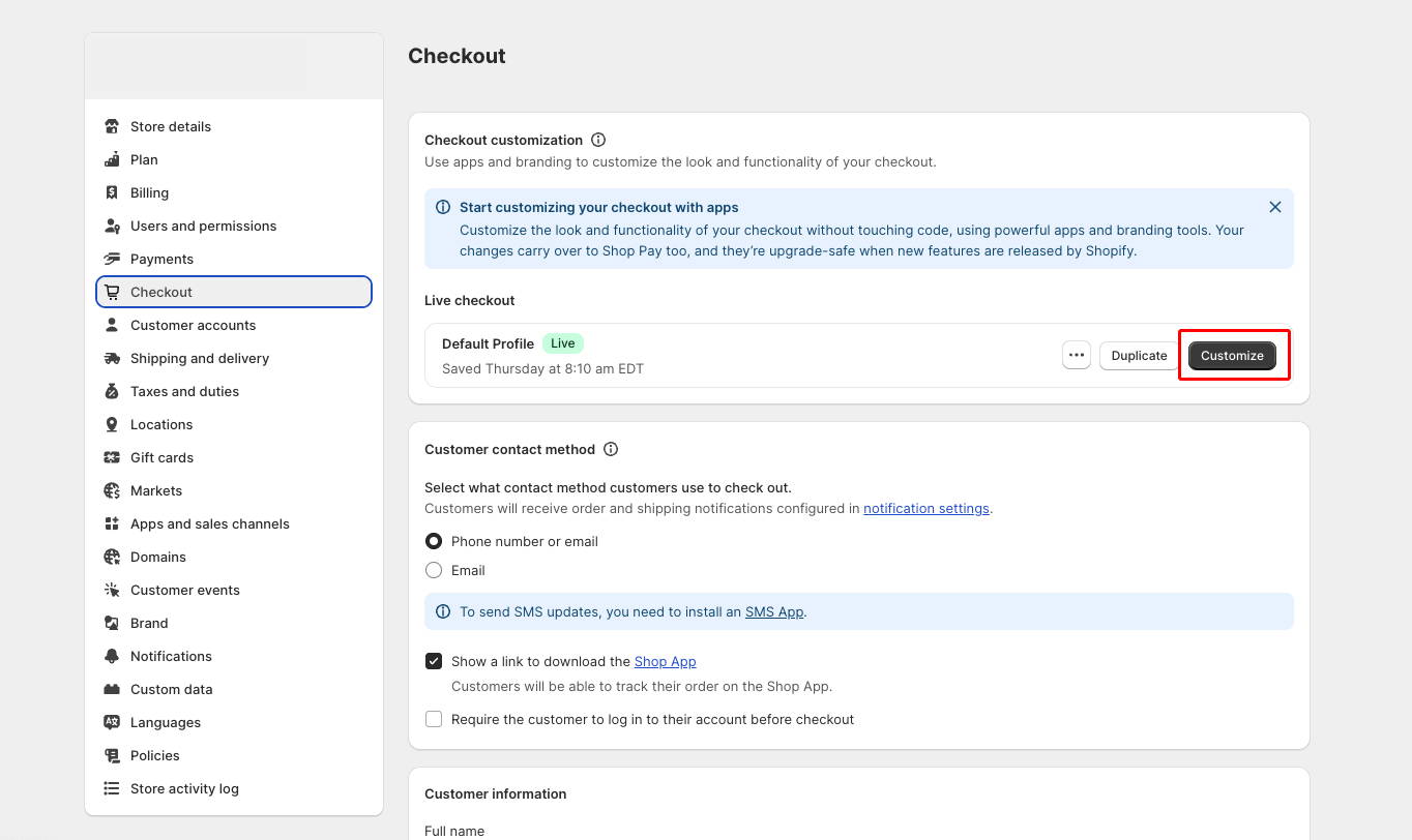
Step 1: Access Checkout editor on Shopify Store Admin Settings
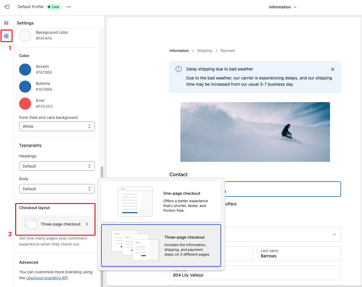
Step 2: Switch between layouts on the Settings
Conclusion: Choose the most suitable, not the newest
The Shopify one-page checkout marks a significant and promising shift from Shopify. They have focused on optimizing the three-page checkout for years until now, introducing a totally new layout for the checkout page. Nevertheless, some businesses may remain committed to their traditional three-page checkout. Merchants, carefully weigh the distinctions between these two checkout types before making an informed decision. Evaluate your current business situation, your selling strategy, whether are you relying on checkout upsell, and your required complex sections on the checkout page, before making a decision.
Remember, not every innovation is universally suitable.
Gain Insightful Knowledge to Grow Your Business Stronger

About The Author
Lauren Nguyen
Growth Marketing Specialist at Qikify
Hey there! Lauren here - the data-driven marketing gal at Qikify. My thing? Providing eCommerce merchants like you with the most valuable insights and streamlined solutions to help grow your online stores and drive more sales. Since joining this exciting industry, I've been all about sharing expertise to boost your success.
When I'm not geeking out over marketing, you'll find me kickstarting my day with a delicious morning coffee (and let's be real, an afternoon cup is a must some days to power through).
Feel free to connect with me through LinkedIn. I'm always stoked to chat with fellow marketing enthusiasts, store owners, swap ideas, and explore cool new collaborations. Together, we can take your online business to new heights!
Table of content
✔️ 14-day Free Trial
Copyright © 2018 - 2023 qikify. All Rights Reserved.


